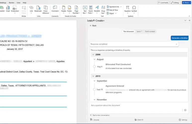
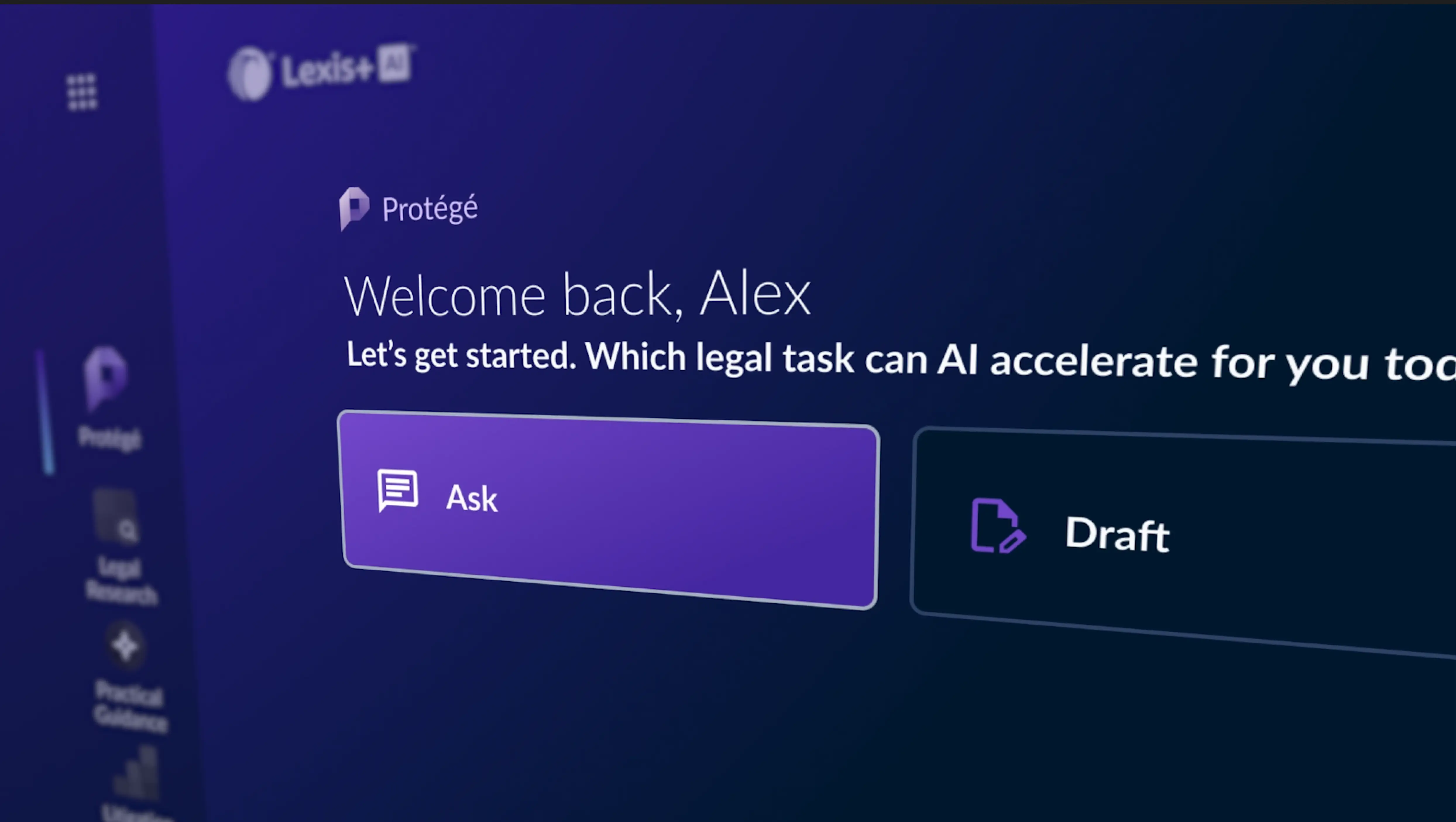
How to Leverage Pre-Built Analysis Like a Pro

18 January 2021 11:39

Busy PR pro uses Newsdesk o monitor media relations activity

What is media monitoring without actionable analysis? Not much, if you ask us. Overly inflated, meaningless metrics damage the credibility of an entire industry and should be cast aside. Instead, Nexis Newsdesk™ urges communications pros to deliver insights that the C-suite will find valuable, relevant and timely—and emphasize the return on investment the public relations function brings to your brand, company or organization.

This isn’t easy work. What’s more, even the most seasoned professionals need a little help now and then.

That’s exactly why Newsdesk offers templated, easy-to-use reporting through our Analysis Builder. We get you started with metrics that matter—visualized through easy-to-interpret charts and graphs—with plenty of ways to further customize your analysis. These automated analyses run on the power of your saved searches or feeds, so they’re always on and always up-to-date. And, they’re shareable through dashboards, newsletters and alerts, ensuring your clients, partners, colleagues and collaborators will always be informed.

Need a refresher on when and how to use our Analysis Builder? Read on!

Five Powerful Dashboards


Any time you create a new analysis within Newsdesk, you have two options from which to start: charts or search. When you select the charts option,you’ll notice five pre-built Analysis templates. These include:

  • Brand Health Analysis: How healthy and active is your brand in the media? These charts interpret brand performance by measuring total mentions, sentiment, reach and share of voice compared to competitors.
  • Competitive Analysis: Understanding how your company or organization stacks up against competitors is a key strategy to identifying opportunities and threats against your brand - and taking proactive measures to build or maintain a competitive advantage. This analysis offers insights into competitor trends, strengths and weaknesses.
  • Industry Analysis: Gauge industry attractiveness and measure industry performance with this pre-built analysis. These charts evaluate a line of business sector, trade or profession - for example, finance, automotive or pharmaceutical industries - and the companies involved it.
  • Market Analysis: Charts here are focused on understanding the dynamics of specific markets, regions and/or countries. They’re great for gauging market attractiveness and measuring market performance, especially in advance of a new product launch or industry expansion.
  • Social Media Analysis: Do you know what people are saying about your brand or organization online? This analysis provides a glimpse into how your searches perform across social media platforms, such as Twitter and Facebook, by visualizing those metrics with the highest social impact.

Once you have selected the analysis of your choosing, you can change which searches are visualized by using the radio buttons or check boxes that appear below each chart. Some charts can support one feed or search, while others can visualize up to 10. Luckily, we take the guesswork out of the process; when you click on a chart name, it will indicate how many searches can be analyzed.

A Picture is Worth 1,000 Words


newsdesk

Representing your media results visually can make all the difference. We’ve made it easy to showcase your results through the appropriate pie charts, line graphs, word clouds and more.While the default visualization will automatically populate for analysis—representing sentiment with a donut ring, for example—each pre-built chart has several options to choose from.

So, if you like the stacked bar chart or donut ring better than the pie chart? Switch it up; get fancy with it! The majority of charts will also allow you to download the native data, enabling you to directly edit and customize them within PowerPoint.

Interact with the Content


The beauty of any Newsdesk analysis is in its ability to drill down into the results. For example, you can change your analysis completely by double-clicking on any area within a chart. Every time you double click on an area within a chart it will add filters and update all charts within your analysis to reflect these changes. You can delete filters easily by clicking the X. It couldn’t be simpler to parse and fine-tune your data.

Sharing the Analysis


Newsdesk makes it easy to share analysis across collaborators, cross-functional teams and other stakeholders. Download relevant charts and graphs as a PDF or PowerPoint; share electronically via alerts, newsletters or emails; collaborate within a shared dashboard; or grab our handy embed code to share via your intranet or website. You can share the entire analysis or individual charts - you can even share the raw article data if you so choose.

With hundreds of analysis charts and options, Newsdesk helps you uncover trends and insights you can act on—fast. Get to know our pre-built analysis dashboards today!

Get in touch
Reasons to get in touch
  • You can't find an answer to your problem on this website
  • You would like to request training
  • You would like a product demonstration
  • You are having trouble logging in or have a technical problem